ito en rebranding
the brief
Chose brand of your liking to redesign their identity. Some things to keep in mind. What are the deficiencies of your client’s current logo? Does it represent them well? Why might you want to change your audience’s perception of your client?
overview
Winter 2021
Timeline — 10 Weeks
Deliverables—New Brand Identity, 1-3 Product Lines, Advertising Campaign, Merchandise, Social Media Presence
the project
Ito En is a Japanese beverage company that makes a variety of tea products from bottled tea to loose leaf. Their most famous line of products is the Oi Ocha unsweetened green tea. Oi Ocha is by far my favorite green tea beverage. In the US, bottled unsweetened tea is difficult to come by and largely un-favored by the general public.
My goal with my redesign was to encourage the young American audience to make healthier beverage choices. Oi Ocha green tea contains zero sugar and is full of antioxidants. By making the brand identity more playful, bright, and colorful, it creates a welcoming aura to draw people towards this healthy alternative to sugary soda and other not-so-great beverages.
Process sketches
A collection of preliminary sketches for the package design and early logo design.
Original Oi Ocha Sketch
Original Hojicha Sketch
Original Koicha Sketch
Original Sencha Sketch
Clover Motif Logo Ideation (Deriven from OG Ito En Logomark)
Leaf Motif Logo Ideation
Final Designs
New redesigned logo variations
Oi Ocha Unsweetened Green Tea
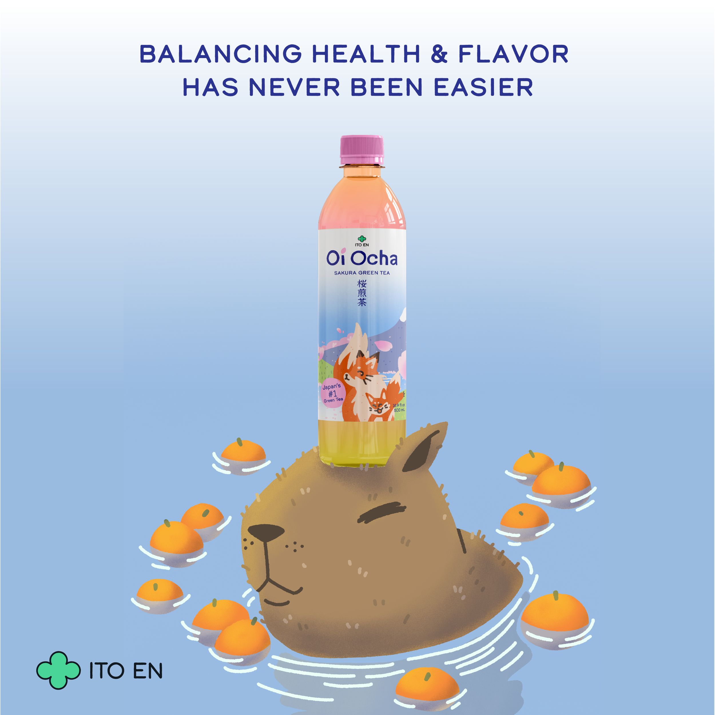
Oi Ocha Sakura Green Tea
oi ocha Product line
Each bottle redesign has three distinct sections, The far left describes the flavor notes in a fun and easy way to read. There is also unique iconography and color palettes for each flavor for easy distinction. Also on every bottle is a seasonal haiku. The middle section includes a playful natural scene showcasing a pair of friendly critters. Ito En’s Oi Ocha tea line is all natural and I wanted to encourage that sentiment with natural and dynamic scenery and animals. Lastly the right side contains nutritional facts, ingredients, servings recommendations, etc.
Hojicha Toasted Green Tea
Koicha Bold Green Tea
bagged tea boxes
In addition to the Oi Ocha bottled line, I wanted to redesign the corresponding bagged tea product line. Each package calls back to the bottled tea of the same tea, making it easy for consumers to buy their favorite flavor.
Hojicha Bagged Tea
Koicha Bagged Tea
Sencha Bagged Tea
Sakura Sencha Bagged Tea
poster series
Set of three posters in the series. My goal was to highlight the natural ingredients & the health benefits of drinking unsweetened green tea. Each poster depicts a fun animal companion, much like the bottles themselves.


Japanese posters 日本語の地口
As a fun bonus I developed a Japanese version of each poster, this time highlighting a funny animal pun. A “ruff” translation (keeping the pun intact) of each would be, “Meow Delicious!”, “Bring Capy-balance into your Life”, and “The Un-frog-gettable Feeling of Home”.

merchandise
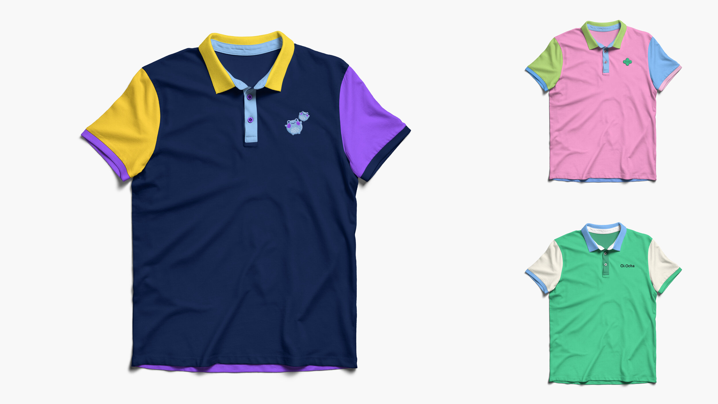
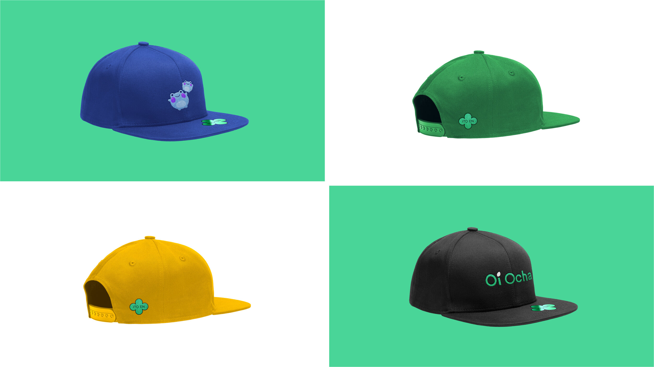
Part of this re-brand was merchandise creation. Below are stickers for reusable water bottles, etc, color-blocking polo shirts featuring key aspects of the tea designs, and snap-back baseball caps.


instagram campaign


